Data Visualization Storytelling
Data is the driving force for successful businesses. Data visualizations, however, are how to make your business data work for you. Effective data storytelling and data visualization storytelling gives your business a competitive edge.
It is not enough to make decisions based on data you do not understand. Data storytelling tools and data visualization tools are what you need to bridge the gap. You need a data storyteller to craft an understandable data visualization story of what the data means to them, to understand it, and make a decision. Outlining the key components of your business’ success story is important, but how do you tell the story?
Data storytelling is the act of converting a set of data into visualizations and narratives. It’s facilitating easier communication and understanding. The growth of online businesses and the use of data is making data storytelling the next big skill in the digital world.
What is data visualization storytelling?
Data storytelling is the act of converting a set of data into visualizations and narratives. Data storytelling facilitates easier communication and understanding. The growth of online businesses and the use of data is making data storytelling the next big skill in the digital world. There are many data storytelling examples that prove the power of an effective data story. You don’t need to be an expert in data science to do data storytelling (and we’ll tell you about that later).

Who is a data storyteller?
A data storyteller is someone who has knowledge about data analytics and can understand data, extract information from it, visualize it, and share it with others. There are three main skills that every data storytelling must master.
- Understanding data.
- Data Visualization Storytelling.
- Data Visualization.
3 Reasons Why Data Storytellers Will Be Invaluable For Defining The Next Decade Of Data.
There are great benefits of data storytelling and storytelling techniques. For a data storyteller, that means a great opportunity in the business world. A good data story helps them win deals through an effective presentation. They communicate effectively and get through to their audience easily. Data stories or data journalism are an essential part of your presentations, and data visualisations must be part of your operations.
The growing need for data storytellers makes them invaluable in the next decade of data usage.
- For effective communication: This is one of the reasons why data storytellers will become invaluable in the next decade. Not everyone understands data or different data variations. Only a data storyteller can, using their storytelling skills. It is the work of a data storyteller to present the data with visuals that best fit the data. Then, breaking this data down into a narrative so it’s easy for a layman to understand what the data is saying. Data visualisations help data storytellers do that, with ease. Multiple graphs, scatter plot diagrams, a line chart, bar charts, and other visual aids can help, but they don’t always get the message across to your target audience.
- The world is constantly changing. That’s another reason why data storytellers will become invaluable in the next decade. Not everyone understands data and not everyone can undertake data analysis. And yet, the world is constantly changing with new technology and developments. Every little thing is represented by data. There is more and more complex data out there. The growth of data and analytic leads us to the growing need for data storytellers for businesses, companies, and brands. Turning complex information into visual elements helps you tell stories with data visualisations, communicate insights and help the growth of your organization’s internal data. A bar chart can showcase the data, but data storytelling is a powerful tool that helps you make informed decisions.
- For strategic marketing: Another reason data storytellers will become invaluable in the next decade is for strategic marketing. The world is constantly evolving and so is everything in it, the world has long moved away from a static form of marketing to visualizing, appealing, and engaging form of marketing. Data storytelling is gradually becoming one of the top means of an effective form of marketing because it has more credibility. As they say, the numbers don’t lie. Using the numbers and stats in a way that people can understand, by making it visually engaging and interesting, is an active way to drive sales, making the needs for data storytellers in the next decade more important. A compelling narrative, that communicates the data insights, leads to better marketing outcomes.
How can Graphite Note can help with data storytelling?
Traditional business intelligence tools are talking about data storytelling, but what they really mean is just a sequence of charts with annotations. Charts that human beings so often have trouble interpreting and understanding.
We know from our experience that sometimes it is very hard for business people to understand even a simple chart.
Graphite is rethinking the whole business intelligence space by combining 3 essential elements: your data and traditional analytics, predictive analytics algorithms, and human communication. Having many data sets is just the start. Interactive dashboards are great, but what do they truly communicate?
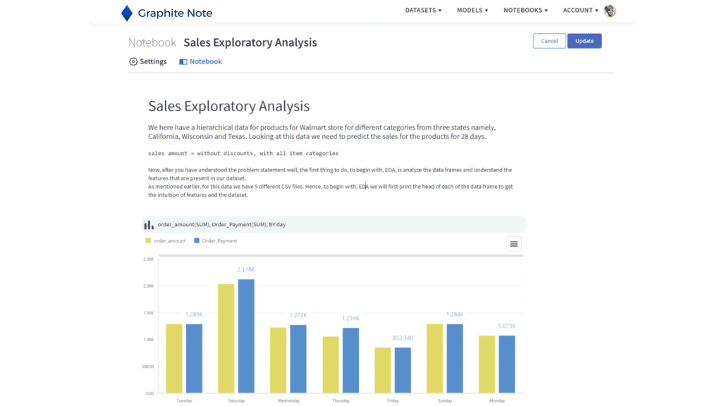
The main idea behind Graphite Note is to do your own Data Storytelling. You can power up your decision making. You can create various visualization with detailed descriptions, insights, plot model results for better understanding, and share that story with your team. You can communicate your key insights in different types of ways.


